
There are settings on a mac that can make working on the computer much easier for anyone with a visual impairment, but also, some of these settings make things easier to view for many users.
This particular setting I have enabled on my computer because it seems to make things appear a little crisper and defined.
How to enable contrast for readability on a mac
Open your System Preferences panel. This may be in your Applications folder, or you may already have it in your Dock.
With the panel opened, you want to select Accessibility.
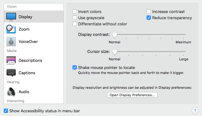
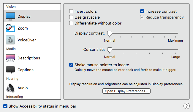
in this panel are a lot of settings and adjustments that you can make to improve your experience, this post only covers contrast. In the Vision menu select Display. There is a tick box where you can enable Contrast.
Check if this is the setting you’d like to use and if it’s useful to you.
Below are two images showing differences with it enabled or disabled.
It’s worth having a look through the settings in this panel and trying out other options that may suit you or a friends machine if you are helping them out.