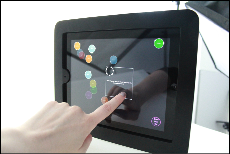
This post examines The interface described will be coded using Xcode, using the interface builder (fig. 20) section of Xcode as well as coding the elements that will not be immediately visible on screen (fig. 21).
Figure 20 Interface designed elements in Xcode.
1.1.1 Direct Manipulation
The nature of the iPad is that you are able to touch the device and it responds.
Shneiderman’s criteria for direct manipulation (1997):
- Continuous representation of the object of interest
- Physical actions or labelled button presses instead of complex syntax
- Rapid incremental reversible operations whose impact on the object of interest is immediately visible.
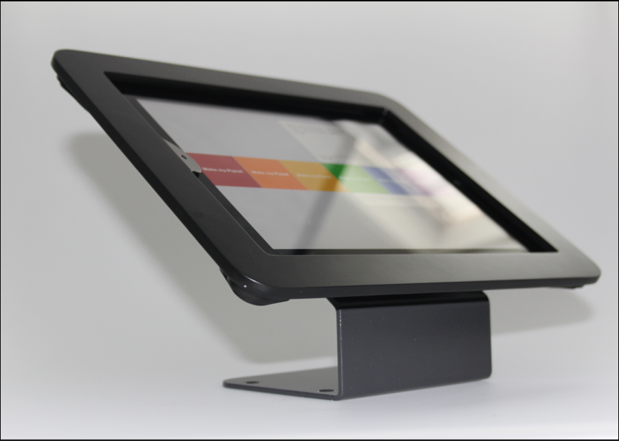
The screen due to its saturation in the public affords touching, and for many, it is also recognized to have pinch and zoom, tap and drag, and other similar touches. It is because of this that the iPad makes a good choice for putting into the retail environment, there is less hardware to install and users know how to use it.
There are other touch screens used and they have similar affordances, we see touch screens in museums and galleries as well as restaurants and movie theatres. Some are less responsive than others however and this can lead to frustration for the user.
1.1 On Screen Elements
The implementation of Last Planet sees some key on screen elements in this prototype. Although there are many possibilities of elements to add[1], as it is the first prototype for testing, it was simple in nature in order to establish if this can be successfully used in a retail environment.

Interface View 1:
Below is the interface at its final stage in this project, this is the view that you would see when approaching the device. (It was the interface used for testing).
[1] Please see 6.2 Further Work for further scope for development.
The elements described:
1 – This is the button to press if you want to create a planet too. It is started by the desire to share a tip with others in the store. Users don’t have to share a tip ultimately, they can choose to simply leave their name, or remain anonymous.
2 – A cluster of names. This is showing that due to the random nature of the layout it is possible that some names overlap.
3 – The planets with a varying number of moons. This is the indication of how many times a name had been selected. Every time one is touched it adds a moon, which rotates at a variety of speeds.
4 – The varying transparency level of a planet.
5 – Showing the overlap and transparency of the names.
6 – the gradient background, just slightly lighter at the very top to show a softly textured background. This offers a visual clue to the surface rather than a solid black reflection.
Interface View 2:

Figure 27 The interface view when they create a planet button is tapped.
1 – The area to be able to type your tip into. If you tap done without entering a tip it will prompt for confirmation.
2 – A button to add a generated tip if the person is unable to think of something and to eliminate there being very few tips to select or read.
3 – The done button when you have written your tip, this turns into the nameField when they are done writing their tip. This way it eliminates additional interface elements.
Figure 28 The name field visible on the interface.
4 – The time and date of the creation of the Last Planet.
5 – The background is obscured when you have opened this view. This is to prevent confusion if you could still see the planets and their animation in full view.
6 – The i button if someone would like additional information about the project. This was only placed there in case someone was very curious and wanted more information or explored the interface.
